Insurance Website Packages
Instructions for Modifying Content | Layout & Formatting Guide | Image Library | Content ChecklistLayout & Formatting Guide
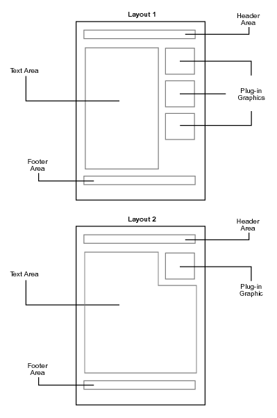
The layout of the page (number of columns, general placement) is as shown below and described in the following sections. These diagrams represent the editable area of the page, which is usually the white area to the right of the navigation buttons and below your company name/logo, except for pages that contain forms (only limited modifications can be made to forms pages -- see below).

Text Area Formatting
The text can be changed to whatever you like. The text can contain links, italics, bold text and underlined text. Blocks of text can also be indented (just like the sections on this page are). You can also have lists, as shown below:
- list item 1
- list item 2
- etc...
Between paragraphs and at the top of the page you can have section headings, if you like. Section headings can be centered or left justified, are always followed by a blank line, and can be any of the following sizes:
- list item 1
- list item 2
- etc...
Section Heading Size 1
Section Heading Size 2
Section Heading Size 3
Header Area Formatting,
Footer Area Formatting
The header and footer areas can contain any of the Text Area formatting options described above. If left blank, the other areas of the page will expand to fill in the gap.
Plug-in Graphics
Plug-in graphics can be inserted in the areas shown in the diagrams. Plug-in graphics are images selected from our library, or digital images that you provide. The images in our library are only available in the sizes shown.
With Layout 1 images are stacked in the right column, where you can display 1 or more images. This is a two-column layout with the text on the left and the images on the right. If no images are specified, the Text Area will expand to fill in the gap.
With Layout 2 you can have up to one image. This is a one-column layout where the text will wrap around the image. If no images are specified, the Text Area will expand to fill in the gap.
In either layout, when no images are selected the text area expands to fill the gap. Therefore Layout 1 with no images selected would look identical to Layout 2 with no images selected.
Important Note: Level I packages are limited to 1 image per site, so some guidelines may not apply.
You cannot edit the text, add images or change the layout of pages that contain forms, with the following exceptions:
- The background color of the forms can be modified (but not the text color).
- The content of the email message that the customer automatically receives after submitting a form can be changed as desired.
- The disclaimer on the last page of the Claim Forms can be edited (applies to Level II packages only). The same disclaimer will appear on all Claim Forms.
Obviously these guidelines do not apply if you are using third-party forms instead of the forms that we supply you with. To make changes to third-party forms you will need to consult the third-party vendor directly.